Creating a toggle top bar section with Beaver Builder Plugin
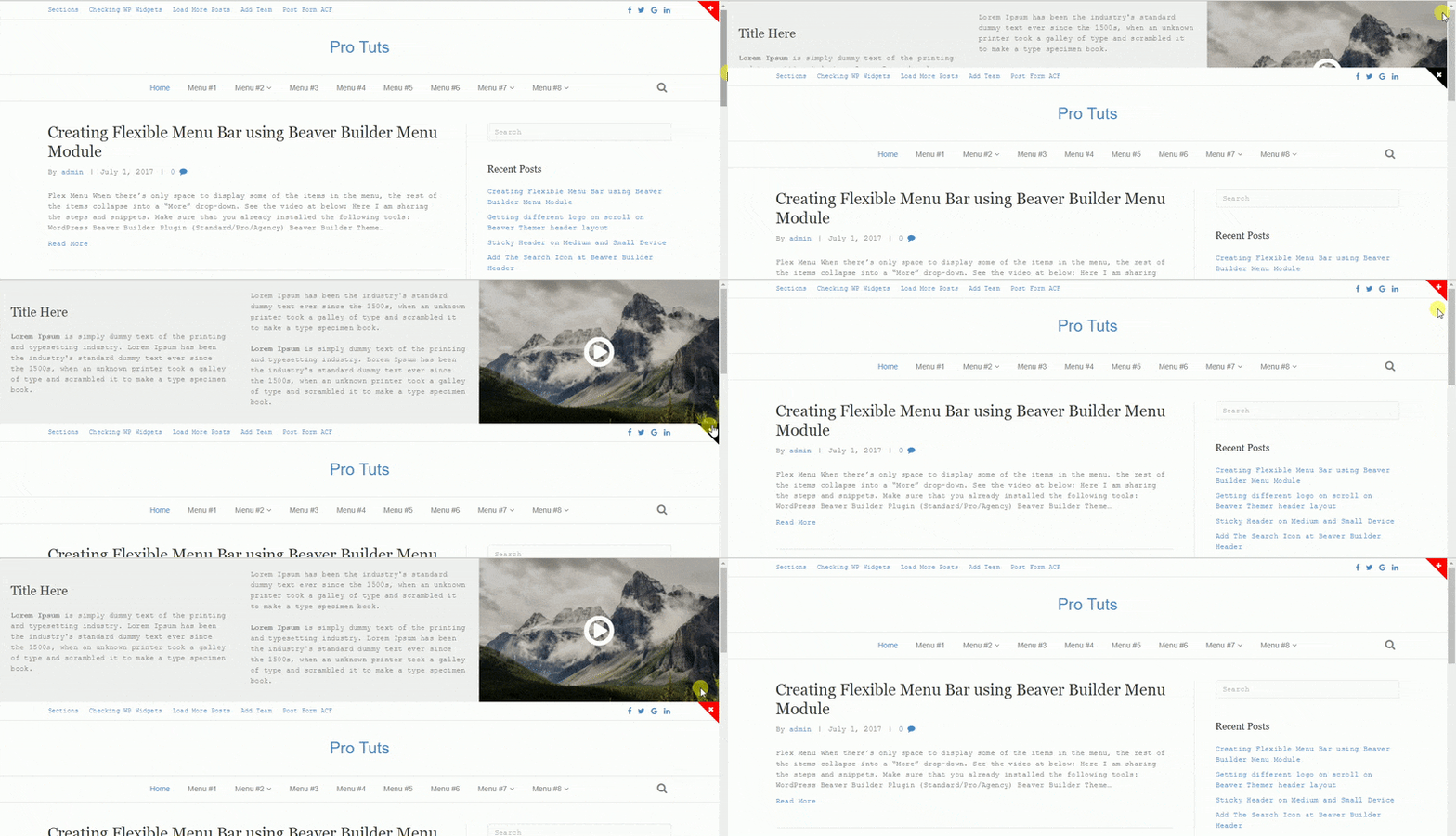
Do you want a full width top bar section(made by BB plugin) with toggle (sliding up/down) effect on your site header? In this article I am showing how you will add the full width Beaver Builder template at top of the site header with toggle button. See the attached screenshot

Creating Full Width Template
At first creating a full width row and save it as template. Follow the steps below:
- Login to Dashboard
- Navigate to Builder -> Templates page
- Click on Add New button (you can use existing one)
- Create a template as per your site design
- Publish the template
Creating JS Script
Creating a JS file “toggle-topbar.js” and save it in theme’s “js” (case-sensitive) folder. You will create the js folder if it is not existing in your theme. Now add the following script into the file. Here is the full content of this file
Toggle Top bar Script
(function(document, $, undefined){

	$(document).ready(function () {

		$('.panel-button').click(function(){
			$('.sliding-panel-wrap').slideToggle();
			$(this).toggleClass('close');
		});

	});

})( document, jQuery );
Enqueue JS File
Loading the above JS file at front end with wp_enqueue_scripts hook. Adding the script file at footer. Open the functions.php file and add this snippet
Enqueue Scripts
add_action( 'wp_enqueue_scripts', 'probb_enqueue_script_toggle_topbar' );
function probb_enqueue_script_toggle_topbar()
{
	wp_enqueue_script( 'toggle-topbar', get_stylesheet_directory_uri() . '/js/toggle-topbar.js', array(), '25072017', true );
}
Using Beaver Builder Theme
open the functions.php file of BB child theme and the following PHP snippet at end of the file. Here I choose the “fl_body_open” hook. It is rendering the BB template content with toggle button above the fl-page markup.
Rendering BB Template with Toggle button
add_action( 'fl_body_open', 'probb_sliding_panel', 1 );
function probb_sliding_panel()
{
echo '' . "n";
echo '' . "n";
FLBuilder::render_query(array(
'post_type' => 'fl-builder-template',
'p' => 948
));
echo '' . "n";
echo '' . "n";
echo '' . "n";
}
Rendering the BB template with FLBuilder:render_query() method. 948 is my template ID. You will replace it with your own template ID. Using the Font Awesome Icon for toggle button which is coming at top right corner of the header with red background color. You can change the button color with CSS (sharing the CSS below).
Later adding the custom CSS code for toggle button. You can write these CSS into bb child theme’s style.css file or Additional CSS section via Theme Customizer (Appearance -> Customize -> Additional CSS). Here is the CSS code
CSS
.sliding-panel {
	position: relative;
}

.sliding-panel-wrap {
	display: none;
	position: relative;
	width: 100%;
	z-index: 1;
}

.panel-button,
.panel-button:hover,
.panel-button:focus,
.panel-button:active {
	color: #fff;
	cursor: pointer;
	opacity: 1;
	line-height: 12px;
	padding: 8px ;
	position: absolute;
	right: 0;
	z-index: 999;

    /* Firefox */
	-moz-transition: transform 3s ease;

	/* WebKit */
	-webkit-transition: transform 3s ease;

	/* Opera */
	-o-transition: transform 3s ease;

	/* Standard */
	transition: transform 3s ease;
}

.panel-button i {
	font-size: 12px;
	width: 12px;
	height: 12px;
	position: relative;
	z-index: 1;
}

.panel-button.close i {
	-ms-transform: rotate(45deg); /* IE 9 */
	-webkit-transform: rotate(45deg); /* Chrome, Safari, Opera */
	transform: rotate(45deg);
}

.panel-button::before {
	content: "";
	position: absolute;
	border-width: 0 40px 40px;
	border-style: solid;
	border-color: transparent #f00 transparent transparent;
	top: 0;
	right: 0;
}

.panel-button:hover::before {
	border-color: transparent #000 transparent transparent;
}
Using GeneratePress Theme
Open the functions.php file of GP child theme or follow this and the following PHP snippets.
Rendering the BB Template with toggle button
add_action( 'generate_before_header', 'probb_sliding_panel', 1 );
function probb_sliding_panel()
{
echo '' . "n";
echo '' . "n";
FLBuilder::render_query(array(
'post_type' => 'fl-builder-template',
'p' => 948
));
echo '' . "n";
echo '' . "n";
echo '' . "n";
}
Rendering the BB template with FLBuilder:render_query() method. 948 is my template ID. You will replace it with your own template ID. Using the Font Awesome Icon for toggle button which is coming at top right corner of the header with red background color. You can change the button color with CSS (sharing the CSS below).
Later adding the custom CSS code for toggle button. You can write these CSS into GP child theme’s style.css file or Additional CSS section via Theme Customizer (Appearance -> Customize -> Additional CSS). Here is the CSS code
CSS
.sliding-panel {
	position: relative;
}

.sliding-panel-wrap {
	display: none;
	position: relative;
	width: 100%;
	z-index: 1;
}

.panel-button,
.panel-button:hover,
.panel-button:focus,
.panel-button:active {
	color: #fff;
	cursor: pointer;
	opacity: 1;
	line-height: 12px;
	padding: 8px ;
	position: absolute;
	right: 0;
	z-index: 999;

    /* Firefox */
	-moz-transition: transform 3s ease;

	/* WebKit */
	-webkit-transition: transform 3s ease;

	/* Opera */
	-o-transition: transform 3s ease;

	/* Standard */
	transition: transform 3s ease;
}

.panel-button i {
	font-size: 12px;
	width: 12px;
	height: 12px;
	position: relative;
	z-index: 1;
}

.panel-button.close i {
	-ms-transform: rotate(45deg); /* IE 9 */
	-webkit-transform: rotate(45deg); /* Chrome, Safari, Opera */
	transform: rotate(45deg);
}

.panel-button::before {
	content: "";
	position: absolute;
	border-width: 0 40px 40px;
	border-style: solid;
	border-color: transparent #f00 transparent transparent;
	top: 0;
	right: 0;
}

.panel-button:hover::before {
	border-color: transparent #000 transparent transparent;
}
Now refresh the front page. You will get small “+” button with red background color at right side of the header. Click on the plus icon and top bar content will appear with smooth animation effect. Click on the cross icon and it will disappear.