Animated Hamburger Icon in Menu Module
You are using the Menu module and trying to get this effect in your mobile menu. You already spent lot of hours and stuck or frustrated to do it. Here is the simple solution for you. Make sure that you already installed the Beaver Builder plugin and created the site menu using BB menu module. Now follow the instruction at below:
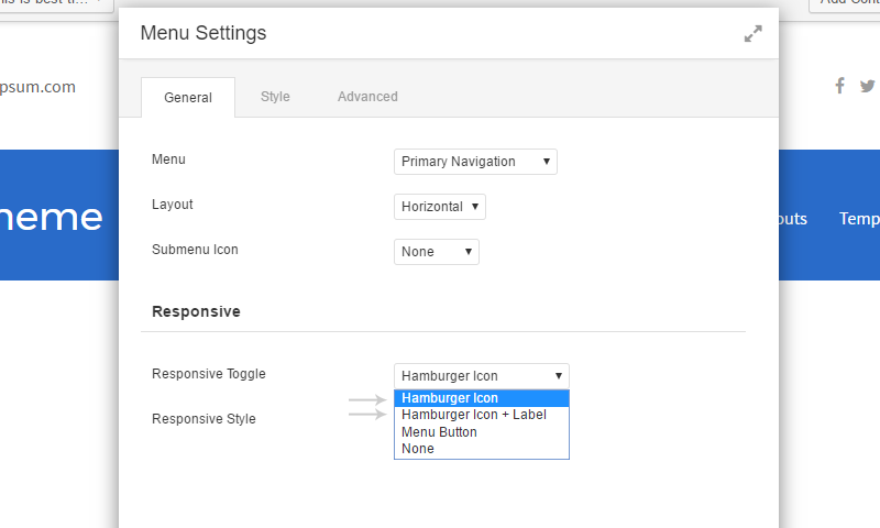
Setting Responsive Toggle Type
Click on “rench” icon of your menu module and select the “Hamburger” or “Hamburger Icon+Label” option from Responsive Toggle drop down list.
Creates Hamburger Icon by CSS
Removing the predefined SVG Hamburger icon image and creating it by CSS. Open the style.css file and add the following CSS code at end of the file
Hamburger/Cross icon
/* Animated Hamburger Icon
------------------------------------------- */

.fl-menu .fl-menu-mobile-toggle .svg-container svg {
	display: none;
	height: 1px;
}

.fl-menu .fl-menu-mobile-toggle:focus,
.fl-menu .fl-menu-mobile-toggle .svg-container:focus {
	outline: 0;
	outline: none;
}

.fl-menu .fl-menu-mobile-toggle.hamburger .svg-container,
.fl-menu .fl-menu-mobile-toggle.hamburger-label .svg-container,
.fl-menu .fl-menu-mobile-toggle .svg-container,
.fl-menu .fl-menu-mobile-toggle .svg-container:after,
.fl-menu .fl-menu-mobile-toggle .svg-container:before {
	background: currentColor;
	cursor: pointer;
	display: inline-block;
	height: 1px;
	position: relative;
	top: -1px;
	-webkit-transition: all 500ms ease-in-out 0s;
	-moz-transition:    all 500ms ease-in-out 0s;
	-o-transition:      all 500ms ease-in-out 0s;
	transition:         all 500ms ease-in-out 0s;
	vertical-align: middle;
	width: 20px!important;
}

.fl-menu .fl-menu-mobile-toggle .svg-container:after,
.fl-menu .fl-menu-mobile-toggle .svg-container:before {
	content: "";
	display: inline-block;
	left: 0;
	position: absolute;
}

.fl-menu .fl-menu-mobile-toggle .svg-container:after {
	bottom: -5px;
	top: auto;
}

.fl-menu .fl-menu-mobile-toggle .svg-container:before {
 	top: -5px;
}

.fl-menu .fl-menu-mobile-toggle.on.hamburger .svg-container,
.fl-menu .fl-menu-mobile-toggle.on.hamburger-label .svg-container,
.fl-menu-mobile-toggle.on .svg-container {
	background: transparent;
}

.fl-menu .fl-menu-mobile-toggle.on .svg-container:after {
	bottom: 0;
	-webkit-transform:  rotate(-45deg);
	-moz-transform:     rotate(-45deg);
	-o-transform:       rotate(-45deg);
	transform:          rotate(-45deg);
}

.fl-menu .fl-menu-mobile-toggle.on .svg-container:before {
	top: 0;
	-webkit-transform:  rotate(45deg);
	-moz-transform:     rotate(45deg);
	-o-transform:       rotate(45deg);
	transform:          rotate(45deg);
}
Toggles the CSS Class by JS Script
The JS script removes the “off” class and adds the “on” class when clicking on the hamburger icon. Opposite action executes when clicking on the “X” icon.
Creates a new JS file “animated-hamburger.js” and put into child theme’s “js” folder. You will create this folder if you have not one. Here is the full code of this JS file:
animated-hamburger.js file
(function($){

	$(function(){
		$( '.fl-menu-mobile-toggle' ).addClass('off');
		$( '.fl-menu-mobile-toggle' ).click(function( event ) {

			if( $(this).hasClass('off') ) {
				$(this).removeClass('off').addClass('on');
			}else{
				$(this).removeClass('on').addClass('off');
			}

		});
	});

})(jQuery);
Loads the Above JS file
Enqueue the script on the site. Open the functions.php file and add this small PHP snippet at end of the file:
Enqueue the scripts
add_action( 'wp_enqueue_scripts', 'frame_animated_hamburger_icon_scripts', 1005 );
function frame_animated_hamburger_icon_scripts()
{
	wp_enqueue_script( 'animated-hamburger', get_stylesheet_directory_uri() . '/js/animated-hamburger.js', array(), '1.6', true );
}
Output