Adding sub menu toggle indicator into responsive menu
In this article I am introducing, how do you add the toggle indicator for collapsed sub menu items into Beaver Builder Theme’s responsive menu. I spent few hours on this matter and got the functionality. Explaining the step-by-step procedure at below.
Creating a JS file
Create a new js file “toggle.sub.menu.js”, add the following code and upload it into the js folder. This file is adding the indicator at right side of the parent menu items and expending/collapsing the sub menu items.
Toggle Sub Menu Items
jQuery(document).ready(function ($) {
  $( '.fl-page-nav-collapse ul.navbar-nav > li > .sub-menu' ).before(
    $( '', {
      'class' : 'sub-menu-toggle',
      'aria-expanded' : false,
      'aria-pressed' : false,
      'role' : 'button'
    } )
    .append( $( '', {
      'class' : 'screen-reader-text',
      text : menuL10n.sunMenu
    } ) )
  );

  $( 'button.sub-menu-toggle' ).on( 'click', function(){
    $(this).toggleClass('activated');
    $(this).prev().parent().toggleClass('fl-mobile-sub-menu-open');
  });
});
Enqueuing the JS file
Loading the above js file on all pages. I used WordPress’s “wp_enqueue_scripts” function which is loading the script/style files on your WordPress site. Open the functions.php file and add the following code at end of the file:
Enqueuing the script file
add_action( 'wp_enqueue_scripts', 'bw_toggle_sub_menu_button' );
function bw_toggle_sub_menu_button() {
  wp_enqueue_script( 'toggle-sub-menu', get_stylesheet_directory_uri() . '/js/toggle.sub.menu.js', array('jquery'), "1.0", true );
  $output = array(
    'subMenu'  => __( 'Menu', 'fl-automator' ),
  );
  wp_localize_script( 'toggle-sub-menu', 'menuL10n', $output );
}
Styling
Adding some extra CSS in the style.css file and placing the indicator at correct place. Remember that CSS will vary based on site design (need some adjustment for padding, color etc).
Style
.sub-menu-toggle {
  display: none;
  visibility: hidden;
}

@media only screen and (max-width: 767px) {

  .nav > li > a {
    display: inline-block;
  }

  .sub-menu-toggle {
    background: #fbfbfb;
    border-width: 0;
    -webkit-border-radius: 0;
    -moz-border-radius: 0;
    -ms-border-radius: 0;
    border-radius: 0;
    display: block;
    margin: 0 auto;
    float: right;
    overflow: hidden;
    padding: 10px 15px;
    position: absolute;
    right: 0;
    top: 3px;
    text-align: center;
    visibility: visible;
    z-index: 9999;
  }

  .sub-menu-toggle:hover,
  .sub-menu-toggle:focus {
    border-width: 0;
  }

  .sub-menu-toggle:before {
    content: "f078";
    display: inline-block;
    font: normal 16px/1 'FontAwesome';
    text-rendering: auto;
    -webkit-transform: translate(0, 0);
    -ms-transform:     translate(0, 0);
    transform:         translate(0, 0);
  }

  .sub-menu-toggle.activated:before {
    content: "f077"!important;
  }

}
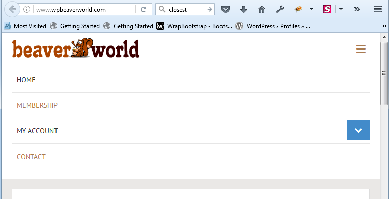
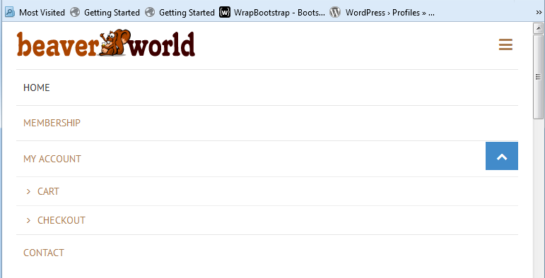
Now review your responsive menu on mobile device. You will see the indicator at right side of every parent menu items.